[dropcap]T[/dropcap]here is a quote attributed variously to Benjamin Franklin or Winston Churchill. I first encountered it on a hand produced wooden plaque at my uncle’s cabin. The cabin is constructed on a side hill and depends heavily on a series of retaining walls and other ground stabilization methods. The gist of the quote is “to fail to plan is to plan to fail.”
This has some implication for us in trying to get our stuff into a WordPress website. Admittedly we are not launching a space shuttle here, but there are some planning steps that we can take prior to firing up WordPress and starting to build. These steps will usually save us time and frustration.
 There was a book written in 1995 by Ray Kristof and Amy Satran called Interactivity by Design that provided one of the first simple models of planning web sites and other types of interactive software and applications.
The book contends that there is planning and thought required in three different areas: Information Design, Interaction Design and Presentation Design.
Information Design
This area of planning seeks to answer the question “what is this?” In other words, what types of information will be provided, how will they be organized to make sense to our users and how will they be organized so that we can access them.
Most modern groceries stores, for instance, put the fresh vegetables all together in one place, the bakery items together in one place, and so on. They also tend not to sell used automobiles. So there is both a scope to their offerings and also an organization.
There is a field of theory called Information Architecture that has its roots in library science that has been adopted and extended for use in web development. It largely involves organizing and labelling information to support cognitive understanding and recall.
In general we want to organize our stuff in a way that makes sense for our users (rather than, for instance, ourselves). There is a developing body of theory and practice that is currently called User Experience (UX) that is concerned with research and theory which leads to understanding how users view our websites and experience the joy or frustration of using them.
Interaction Design
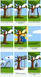 This area of planning seeks to answer the question “how does it work?” I sometimes think of web sites as being little machines, we press a button and something happens (hopeful). It needs to be obvious to people what should happen when a button or a menu is pressed.
In the early days of the web there was much experimentation in this regard but to a large extent some standards have developed over time. WordPress and its plugins and themes provide much of this functionality for us in terms of navigation, menus and so forth.
However, sometimes the need for new interaction options emerge. For instance, most of us now are used to the idea that smart phones and tablets have a form of interaction known as “swiping”. This is pretty much new in the last decade or so and many WordPress themes and plugins are emerging that enable this facility.
In terms of planning, if most of your users are on desktop or laptop computers you may not need to plan for swipe-based interactivity, if most are mobile devices then the opposite will be the case.
Presentation Design
This area seeks to answer the question “what does it look like?” Colours, fonts, layout, these are the types of considerations that take place in presentation design.
Of course this area of design has its roots in print and graphic design, but there has been an evolution in design theory and practice to encompass interactive things like web sites.
So, how do I do these things?
There is a whole variety of tools and techniques that have been developed to guide the design planning process. Generally the first tool is some research and some thinking followed by a way to capture this thought and perhaps present it visually. Three of the simplest and most useful tools are site maps, wire frames and screen designs. There is an emerging thing that some call style guides and others call pattern libraries that are starting to replace screen designs for web sites with large amounts and variety of content.
Site maps
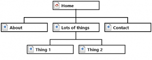 A site map looks very similar to an organizational chart or family tree diagram. Generally the Home Page is by itself at the top and then the next level contains the major site areas or topics which are each further broken down into sub-sections or sub-topics.
The pros often argue about which specialized tool is best for doing this type of work, but quickly frankly anything that will build an org. chart type diagram or point form outline (including a pen and a piece of paper) is perfectly fine.
Site maps are used to capture and communicate our information architecture, what information we have and how it is organized and structured.
Wire frames (sometimes called schematics)
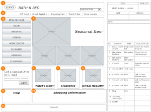 This is a tool used to sketch out what the major areas of a web page on a certain screen size will be and what is in those areas, e.g.) logo/page title, navigation, content, side bar blog summary areas, ads (blech), etc.
Similar in a way to a building architect’s blue print, its job is to aid in organizing the space and communicating that organization to others. We will commonly develop wire frames for the key types of pages in the site, so perhaps the home page, major section pages and a representative page for each type of content.
It is also common to develop wireframes for different sizes of screens such as: desktop/laptop, tablets, phones and other mobile devices.
Wire frames are intentionally devoid of colour, graphics, fonts, etc. to narrow the focus to just how the page is organized. It doesn’t matter what font or colour something is if it is not the right thing in the right place.
Screen designs
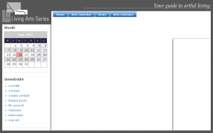 Building on the structure developed in the wire frames we now bring all the visual design elements into play for each of our major types of pages. Again, there are many tools used for this purpose (Photoshop is quite a popular choice) but anything, including paper and things that make marks on it, is useful.
The guiding principle is that is quicker and easier to plan the design elements first and then build them afterwards.
Style guides or Pattern libraries
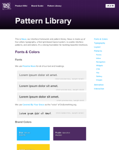 This type of planning document (some times developed as a web site section) is about designing the bits and pieces that make up web pages rather than the whole page themselves.
The idea is that a web site might contain dozens of bullet lists, so a design for bullet lists is developed and detailed in the style guide. The same goes for things like heading levels, ways of handling images, navigation and buttons, etc.
The aim is the same as with screen designs, but we are breaking things up into smaller pieces.
What’s the point?
One goal of all these types of planning and planning documents is to save more time in production that it takes to do the planning.
A more important goal is to provide an enjoyable overall experience for users as they pursue their interests and goals on our websites.